UPLIFT Performing Arts
Youth dance studio
Parents don’t buy dance classes. They buy the memory of their kid in the spotlight.
“Help us leave the old name behind and become a real performing arts academy.”
New ownership, a brand with baggage, and a vision bigger than dance.
How we got there
Look around Where do you stand?
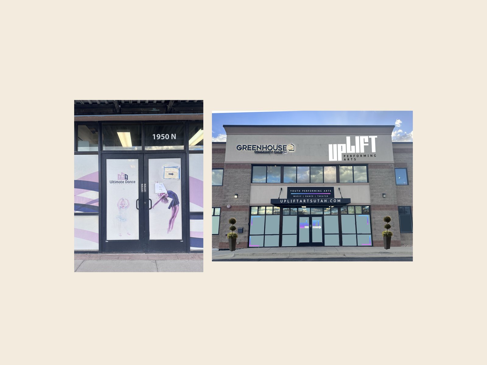
- A taped paper sign on the front door
- Three different looks across two documents
- The site was built around logins, not new families
Look outward Who is it for?
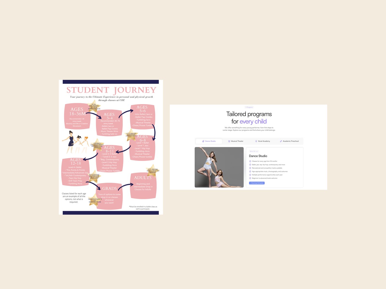
- Before: a map nobody could read
- After: every page answers a parent’s first question
- Same information, organized around the customer
Look ahead Who do you want to become?
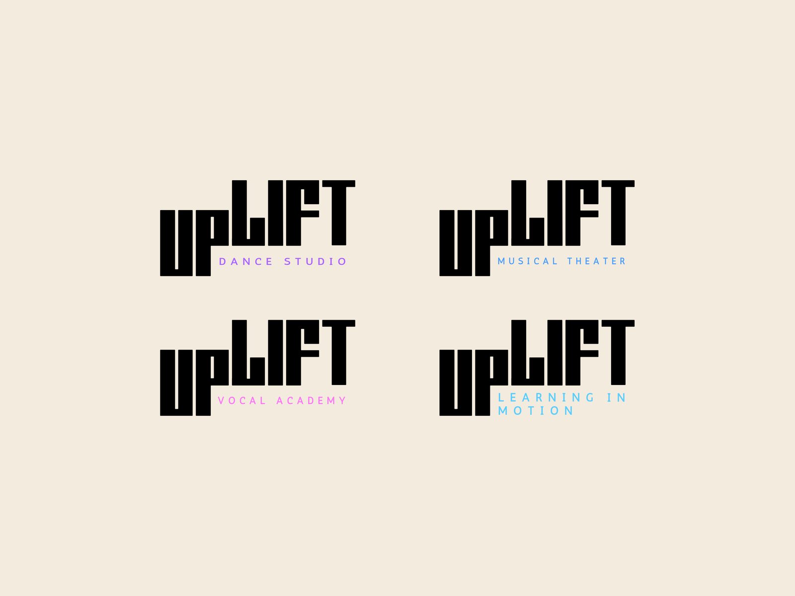
- It was two businesses: dance and a preschool
- One master brand, with room for new programs and new locations
Look right How should it look, sound and feel?
- “up” sits low and “LIFT” climbs: the word literally lifts
- Square letters build frames and right angles
- Rounded corners soften it: youth and recreational, not cutthroat
- The camera aperture shows where the focus is, so parents know we see their kid the way they do
- The gradient holds every program’s color
The formula
dance +preschool +room to grow = one brand
What changed
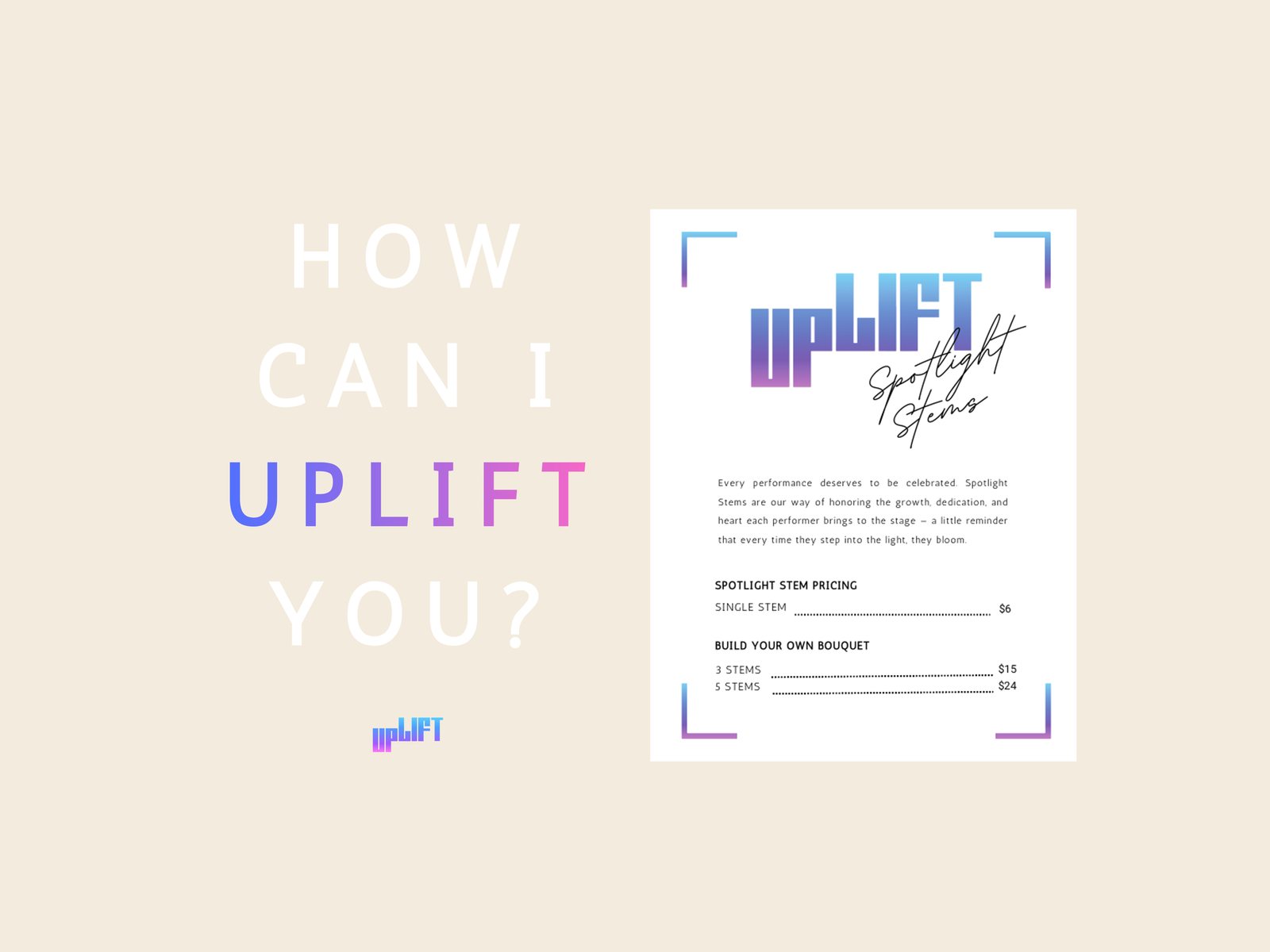
The Spotlight Stems flower bar sold $700+ in a single recital night, more than the studio’s total merch and gift sales the year before.